From Three Sites to One Powerful Platform

01
ABOUT THE PROJECT
Overview
Trishul Defence Academy, established in 2004, offers coaching for NDA, SSB, and other defence exams. Their digital presence was fragmented—spread across three separate domains with inconsistent design, poor responsiveness, and confusing navigation. Key features like student dashboards, courses, and payments were disjointed and hard to access. To address this, we led a complete redesign—merging all domains into one unified, responsive platform. The goal was to streamline user flow, improve accessibility for students and parents, and create a scalable, user-friendly experience that drives better engagement and growth.
Timeline
4 Months
Beginning with a comprehensive website audit and structural recommendation. Once approved, we moved into design exploration, followed by development and deployment.
Team
Project Manager, Product Designer, Graphic Designer, Content Writer, Development Team, SEO Team
Role
Project Manager & Designer
I led the project as Project Manager and Lead Designer, conducting UX audits, defining the new website structure, and driving the redesign strategy to improve user flow for both parents and students.
Understanding the Gaps Before Building the Solution
Every redesign starts with identifying what’s broken—not just for the users, but also for the business. We mapped out key friction points that were affecting usability, discoverability, and conversions. This helped define a solution that was both user-first and business-aligned.
User Pain Points
🧭
Confusing Navigation
Users struggled to find key pages like courses, admissions, or dashboard access due to a cluttered nav and no clear user journey.
📱
Poor Mobile Experience
The website wasn’t optimized for mobile devices, making it difficult to browse, read, or take action on phones—where most users landed.
💳
No Clear Way to Buy or Pay
Whether enrolling in a course or purchasing a book, users didn’t know how or where to complete the transaction—causing frustration and drop-offs.
🧱
Overwhelming & Unscannable Content
Text-heavy pages, intrusive pop-ups, and long scrolls made it hard for users—especially parents—to find the information they needed quickly.
Operational & Growth Challenges
💸
Broken Payment Flows = Lost Conversions
A messy, non-intuitive checkout experience for both courses and books directly impacted revenue generation.
📢
Missing CTAs = Missed Leads
The lack of strategic “Inquire Now” or “Contact” buttons meant many high-intent visitors left without converting.
🌐
Fragmented Web Structure
Three separate domains created SEO inefficiencies, brand inconsistency, and added operational overhead for the team.
🛒
Underperforming Bookstore
The books section lacked structure, product clarity, and buying tools—resulting in low product engagement and poor sales.
03
APPROCH
Our Approach to Rebuilding the Experience
We followed a structured, collaborative process—from understanding the core problems to implementing a scalable, user-first solution. Each phase was designed to streamline the user journey, centralize control, and bring the academy’s digital presence up to modern standards.
Phase 1: Discovery
We began by aligning with the client to understand the goals, challenges, and expectations. This involved identifying pain points, user types, and business constraints—setting the foundation for a focused redesign.
Phase 2: Research & Competitive Analysis
Next, we conducted a detailed UX audit and analyzed competing defence coaching websites to benchmark structure, usability, and user flows. This helped us identify critical gaps and missed opportunities in the existing experience.
Phase 3: Information Architecture & Navigation Strategy
We proposed merging the three fragmented domains into one unified site. With that decision made, we restructured the entire navigation and created a clean, intuitive information architecture aligned with how users search, browse, and take action.
Phase 4: Wireframing & UX Planning
Once the structure was defined, we moved into wireframing. Working collaboratively as a design team, we built wireframes around a clean, structured theme focused on clarity and accessibility—designed to support both students and parents in navigating key actions easily.
Phase 5: Visual Design & UI System
The visual theme was minimal, modular, and aligned with TDA’s brand. We used a bold-yet-approachable style to build trust and ensure a seamless, scalable user experience.
Phase 6: Development & Implementation
As designs were approved, we shared them with the development team. The site was built using Strapi as the CMS—allowing the client to control all content from a centralized dashboard, with improved performance and flexibility.
03
PROCESS
Research & Competitive Benchmarking
Before jumping into design, we conducted a comprehensive UX audit and competitor analysis to understand both user expectations and market standards. We examined how leading defence coaching platforms structure their websites, organize content, and use visual hierarchy to guide users. Based on these insights—and aligned with client goals—we identified focus areas and outlined what needed to be addressed in our redesign.
Key Focus Areas Identified:
Homepage Structure
Needed better hierarchy with an announcement bar, hero section, and repositioned key content like "Courses" and "Why Trishul" for visibility.
Navigation Overhaul
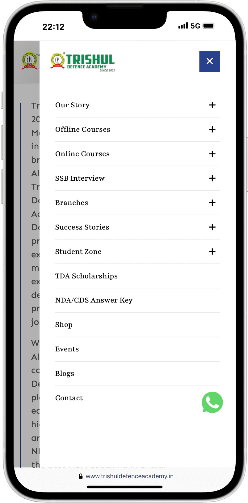
Simplify the nav bar using a mega menu and introduce a clear, persistent “Inquire Now” CTA.
Content Reorganization
Prioritize course details and exam info. Reduce excessive scrolling and visual clutter with tabs, accordions, and sticky elements.
Books Section Redesign
Introduce a cart, wishlist, and detailed layouts for smoother browsing and purchasing.
Smooth Conversion Flow
Replace disruptive pop-ups with embedded CTAs and fixed contact forms on course pages.
Dedicated Pages
Add structured pages for Admissions, Success Stories, and Courses Overview.
Highlight Offline Strength
Use virtual tours, facilities showcases, and a “Skills That Need Real Practice” section to communicate the offline training value.
Event Visibility
Introduce an Events page to feature upcoming campus engagements, assessments, and workshops.
04
SOLUTION
Solution
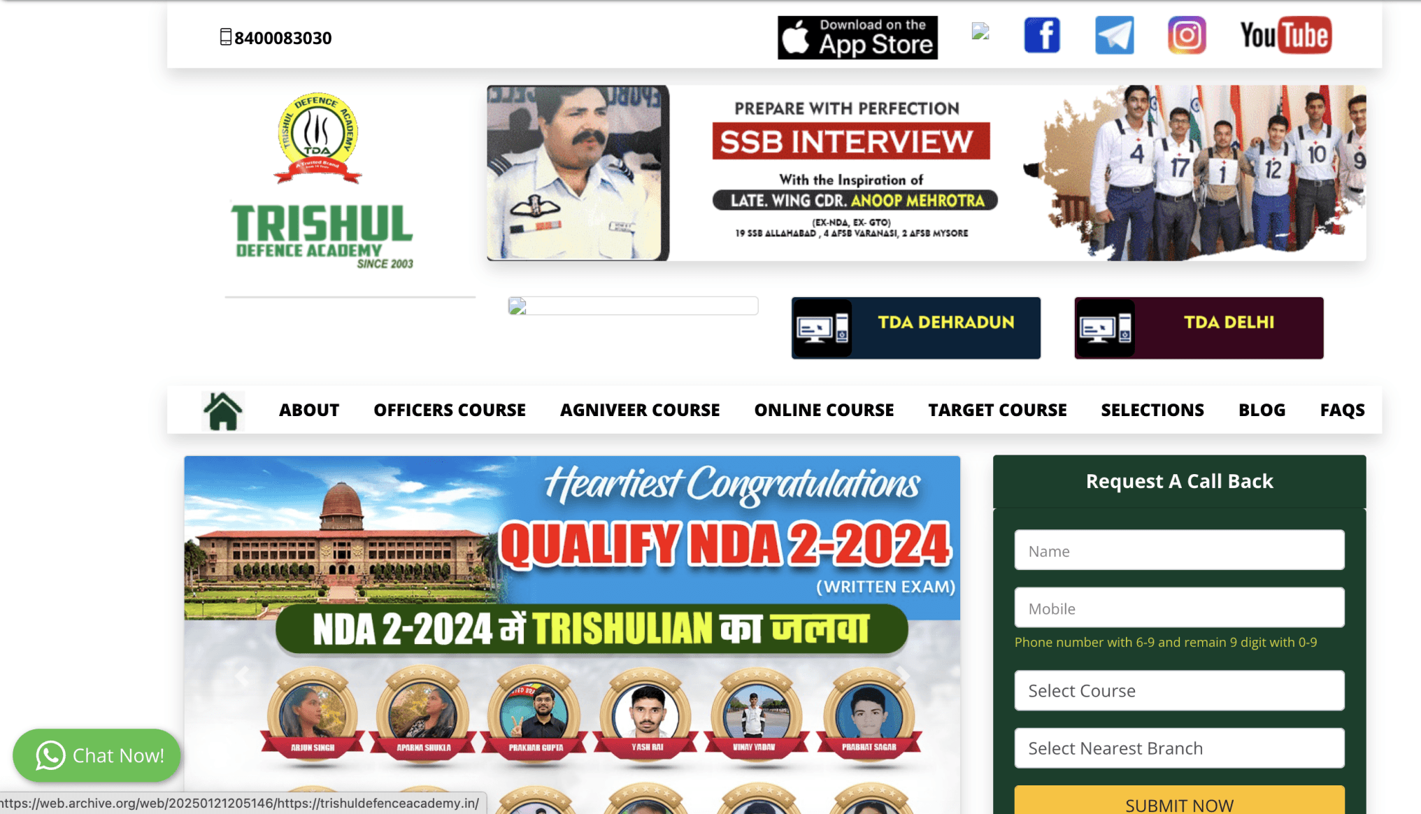
The original website lacked a cohesive structure, making it difficult for users to navigate, explore courses, or complete payments smoothly. We began by completely revamping the navigation and content hierarchy across all three websites under the brand. This unified approach ensured consistency while catering to different user intents.
Key Solutions Implemented:
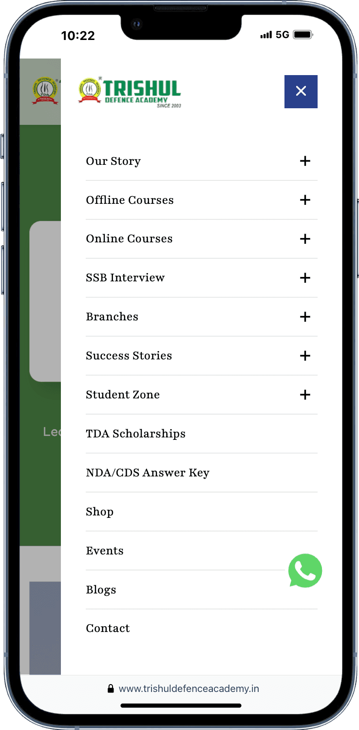
Streamlined Navigation
Redesigned the navigation bar with logical grouping, reduced clutter, and introduced a mega menu for easier access to core sections.

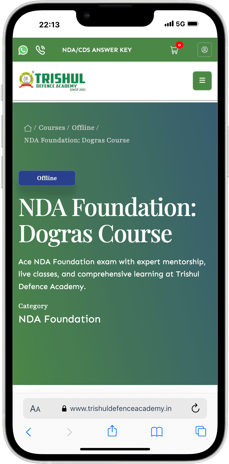
Course Card System
Built structured course cards that clearly indicated the course type, category, and mode (online/offline), improving discoverability.
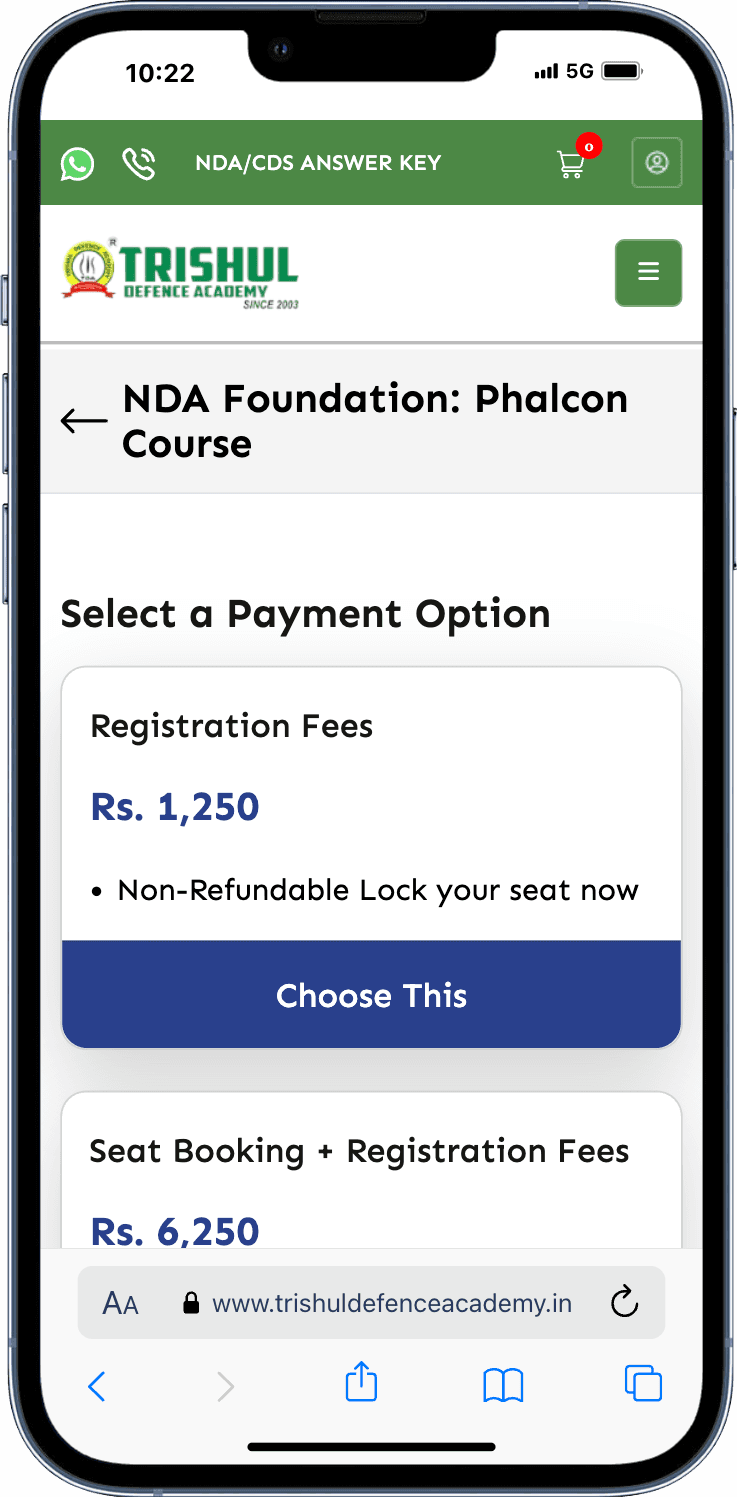
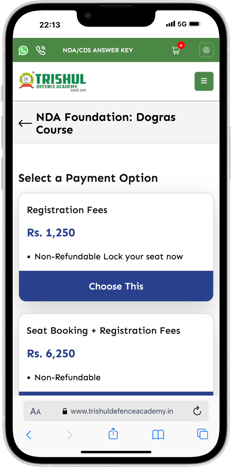
Optimized Payment Flow
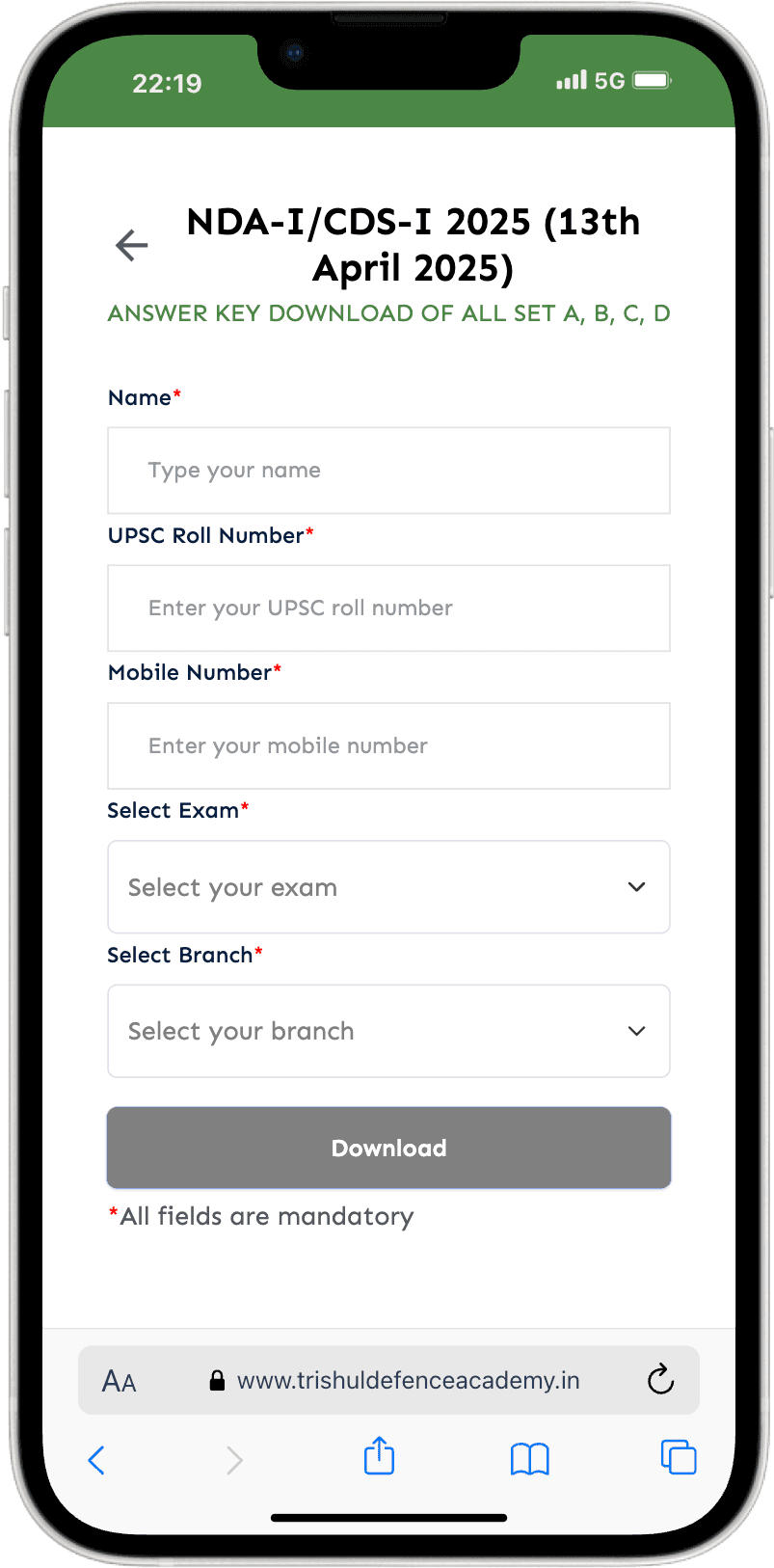
Designed a step-by-step, intuitive course checkout journey to reduce drop-offs and simplify transactions.
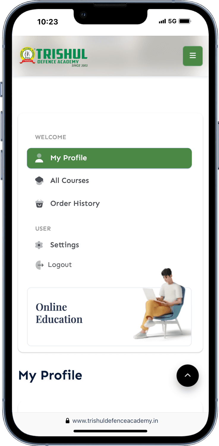
User Dashboard
Rebuilt the profile section to allow users to track their enrolled courses, book orders, and payment history, all in one place.
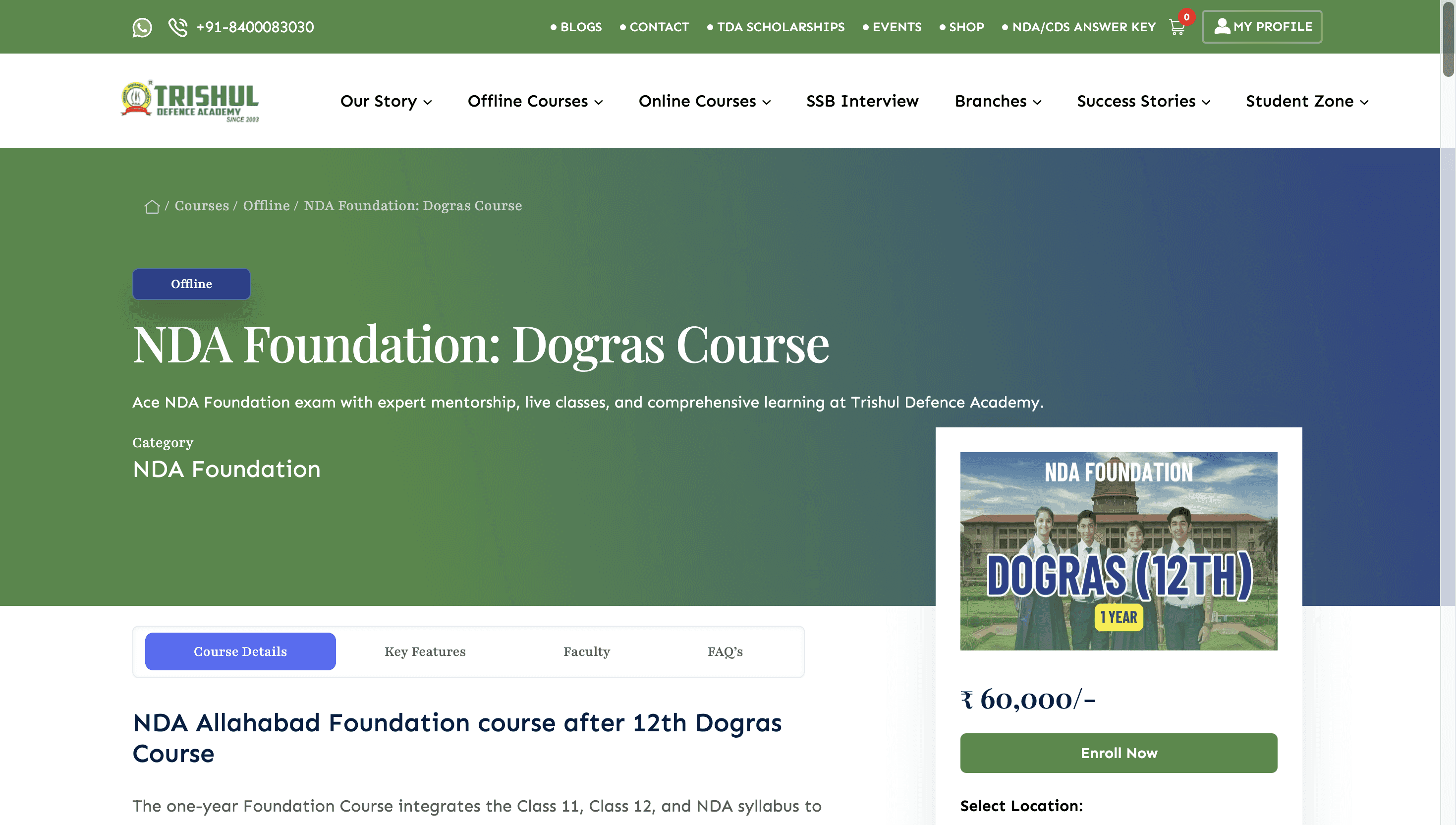
Before & After: UI Transformation

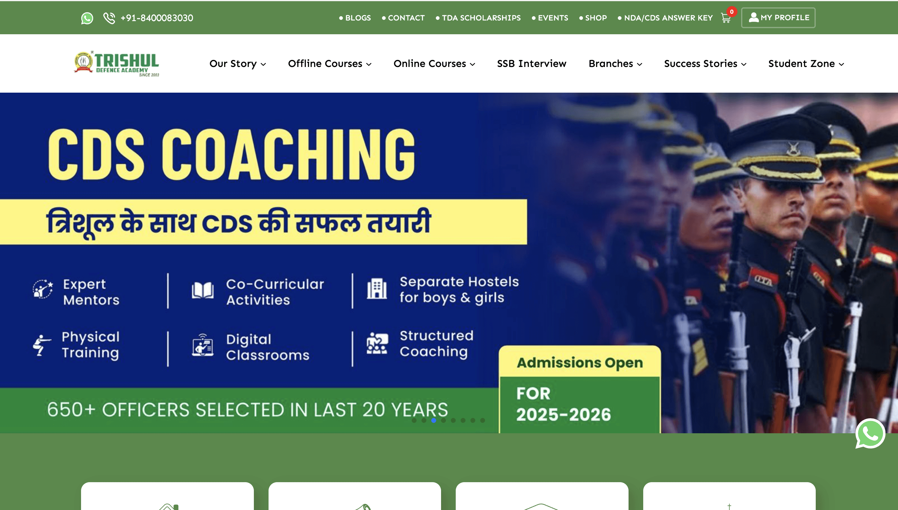
Homepage
Introduced a streamlined navigation system, unifying all three websites under a single, cohesive structure.

Courses Page
Designed standardized course cards showing course type, category, and delivery mode—enhancing scannability and clarity.
05
RESULT
The Result
Before the redesign, the combined traffic across all three platforms was around 7,5000 users/month. Despite a leaner and more focused structure post-redesign, the new site consistently drove over 30,000 users/month— a 4x growth.
This growth wasn't just in numbers—it was a reflection of how a better user experience directly translated into improved engagement, smoother onboarding, and ultimately stronger business performance.
Role
Product Designer
Timeline
4 Months

Understanding the Gaps Before Building the Solution
Every redesign starts with identifying what’s broken—not just for the users, but also for the business. We mapped out key friction points that were affecting usability, discoverability, and conversions. This helped define a solution that was both user-first and business-aligned.
User Pain Points
🧭
Confusing Navigation
Users struggled to find key pages like courses, admissions, or dashboard access due to a cluttered nav and no clear user journey.
📱
Poor Mobile Experience
The website wasn’t optimized for mobile devices, making it difficult to browse, read, or take action on phones—where most users landed.
💳
No Clear Way to Buy or Pay
Whether enrolling in a course or purchasing a book, users didn’t know how or where to complete the transaction—causing frustration and drop-offs.
🧱
Overwhelming & Unscannable Content
Text-heavy pages, intrusive pop-ups, and long scrolls made it hard for users—especially parents—to find the information they needed quickly.
Operational & Growth Challenges
💸
Broken Payment Flows = Lost Conversions
A messy, non-intuitive checkout experience for both courses and books directly impacted revenue generation.
📢
Missing CTAs = Missed Leads
The lack of strategic “Inquire Now” or “Contact” buttons meant many high-intent visitors left without converting.
🌐
Fragmented Web Structure
Three separate domains created SEO inefficiencies, brand inconsistency, and added operational overhead for the team.
🛒
Underperforming Bookstore
The books section lacked structure, product clarity, and buying tools—resulting in low product engagement and poor sales.
From Three Sites to One Powerful Platform
03
APPROCH
Our Approach to Rebuilding the Experience
We followed a structured, collaborative process—from understanding the core problems to implementing a scalable, user-first solution. Each phase was designed to streamline the user journey, centralize control, and bring the academy’s digital presence up to modern standards.
Phase 1: Discovery
We began by aligning with the client to understand the goals, challenges, and expectations. This involved identifying pain points, user types, and business constraints—setting the foundation for a focused redesign.
Phase 2: Research & Competitive Analysis
Next, we conducted a detailed UX audit and analyzed competing defence coaching websites to benchmark structure, usability, and user flows. This helped us identify critical gaps and missed opportunities in the existing experience.
Phase 3: Information Architecture & Navigation Strategy
We proposed merging the three fragmented domains into one unified site. With that decision made, we restructured the entire navigation and created a clean, intuitive information architecture aligned with how users search, browse, and take action.
Phase 4: Wireframing & UX Planning
Once the structure was defined, we moved into wireframing. Working collaboratively as a design team, we built wireframes around a clean, structured theme focused on clarity and accessibility—designed to support both students and parents in navigating key actions easily.
Phase 5: Visual Design & UI System
The visual theme was minimal, modular, and aligned with TDA’s brand. We used a bold-yet-approachable style to build trust and ensure a seamless, scalable user experience.
Phase 6: Development & Implementation
As designs were approved, we shared them with the development team. The site was built using Strapi as the CMS—allowing the client to control all content from a centralized dashboard, with improved performance and flexibility.
03
PROCESS
Research & Competitive Benchmarking
Before jumping into design, we conducted a comprehensive UX audit and competitor analysis to understand both user expectations and market standards. We examined how leading defence coaching platforms structure their websites, organize content, and use visual hierarchy to guide users. Based on these insights—and aligned with client goals—we identified focus areas and outlined what needed to be addressed in our redesign.
Key Focus Areas Identified:
Homepage Structure
Needed better hierarchy with an announcement bar, hero section, and repositioned key content like "Courses" and "Why Trishul" for visibility.
Navigation Overhaul
Simplify the nav bar using a mega menu and introduce a clear, persistent “Inquire Now” CTA.
Content Reorganization
Prioritize course details and exam info. Reduce excessive scrolling and visual clutter with tabs, accordions, and sticky elements.
Books Section Redesign
Introduce a cart, wishlist, and detailed layouts for smoother browsing and purchasing.
Smooth Conversion Flow
Replace disruptive pop-ups with embedded CTAs and fixed contact forms on course pages.
Dedicated Pages
Add structured pages for Admissions, Success Stories, and Courses Overview.
Highlight Offline Strength
Use virtual tours, facilities showcases, and a “Skills That Need Real Practice” section to communicate the offline training value.
Event Visibility
Introduce an Events page to feature upcoming campus engagements, assessments, and workshops.
04
SOLUTION
Solution
The original website lacked a cohesive structure, making it difficult for users to navigate, explore courses, or complete payments smoothly. We began by completely revamping the navigation and content hierarchy across all three websites under the brand. This unified approach ensured consistency while catering to different user intents.
Key Solutions Implemented:
Streamlined Navigation
Redesigned the navigation bar with logical grouping, reduced clutter, and introduced a mega menu for easier access to core sections.
Course Card System
Built structured course cards that clearly indicated the course type, category, and mode (online/offline), improving discoverability.
Optimized Payment Flow
Designed a step-by-step, intuitive course checkout journey to reduce drop-offs and simplify transactions.
User Dashboard
Rebuilt the profile section to allow users to track their enrolled courses, book orders, and payment history, all in one place.
Before & After: UI Transformation
Homepage
Introduced a streamlined navigation system, unifying all three websites under a single, cohesive structure.
Courses Page
Designed standardized course cards showing course type, category, and delivery mode—enhancing scannability and clarity.
01
ABOUT THE PROJECT
Overview
Trishul Defence Academy, established in 2004, offers coaching for NDA, SSB, and other defence exams. Their digital presence was fragmented—spread across three separate domains with inconsistent design, poor responsiveness, and confusing navigation. Key features like student dashboards, courses, and payments were disjointed and hard to access. To address this, we led a complete redesign—merging all domains into one unified, responsive platform. The goal was to streamline user flow, improve accessibility for students and parents, and create a scalable, user-friendly experience that drives better engagement and growth.
Timeline
4 Months
Beginning with a comprehensive website audit and structural recommendation. Once approved, we moved into design exploration, followed by development and deployment.
Team
Project Manager, Product Designer, Graphic Designer, Content Writer, Development Team, SEO Team
Role
Project Manager & Designer
I led the project as Project Manager and Lead Designer, conducting UX audits, defining the new website structure, and driving the redesign strategy to improve user flow for both parents and students.
05
RESULT
The Result
Before the redesign, the combined traffic across all three platforms was around 7,5000 users/month. Despite a leaner and more focused structure post-redesign, the new site consistently drove over 30,000 users/month— a 4x growth.
This growth wasn't just in numbers—it was a reflection of how a better user experience directly translated into improved engagement, smoother onboarding, and ultimately stronger business performance.